The mobile-first indexing of Google is not a future possibility that we might want to prepare for. It is not something hypothetical. It is a certainty that has already taken place. It has unfurled; it has rolled out. It is live and has effectively become our new indexing reality.
In case you missed it, Google now uses the mobile version of your website as the principal source for indexing and ranking. That means your mobile experience isn’t just important; it’s everything. If your site doesn’t perform well on smartphones, you might already be falling behind.
Mobile-first indexing is something that every website owner should be aware of. It is not the latest trend or even an algorithm update per se. It is what Google is now doing. And how it affects your website is a very big deal. Why? Because if you have not embraced the mobile web, you are in for a rude transition. What you need to do right now is make your website usable on all types of devices. And I mean all types. That mobile web? It’s here to stay.
What Is Mobile-First Indexing, Really?
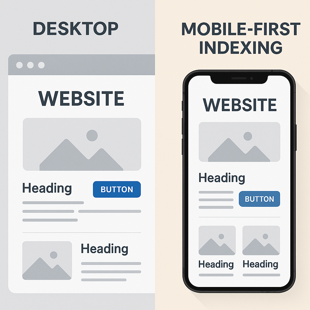
Essentially, mobile-first indexing means that Google examines the mobile version of your site first. This is a huge shift from the way things used to be. With prior forms of indexing, the desktop versions were the primary reference points. However, times have changed.
Over 60% of searches now originate from mobile devices—a figure that continues to rise. Google has adjusted to this new reality; not you have to.
It’s a problem for your rankings if your mobile site has no important content, has a poor structure, or is slow to load. Those factors not only give mobile users a bad experience, but search engines also take notice.
Why Google Switched to Mobile-First
Let’s be real: smartphones are the go-to gadget. We seek, sift, shop, and show off from our handhelds. Seems only fitting that Google would follow the trend.
This transformation wasn’t arbitrary. It’s related to how users behave and what they expect. If your website doesn’t fulfill those mobile expectations, your site is going to have a hard time keeping its Google ranking. And if it’s not showing up as well in Google, it’s not showing up as well anywhere.
How Mobile-First Impacts Your SEO
Here’s the deal: if your desktop site is amazing but your mobile site is either basic or poorly designed, Google won’t pay attention to all the great stuff on your desktop. The deciding version is the mobile one.
Even worse, your mobile version can obscure or eliminate content that, for the sake of simplicity or speed, may not be indexed at all.
Consider it this way: Google reads just a single version of your tale. Ensure that the version it reads is optimized for mobile. And, by the way, if you haven’t punched up that version in a great way, you ought to do so.
Signs Your Site Isn’t Mobile-First Ready
Unsure about your position? Take a look at these warning signs.
- The content on your mobile site is less than on your desktop site.
- Loading pages on mobile takes a long time.
- You continue to rely on a distinct “m.” mobile URL, as opposed to a responsive design that works across various devices.
- The main content is obstructed by pop-ups or intrusive interstitials.
- Users on mobile can’t quickly locate what they are trying to find.
Does that ring a bell? Then now’s the moment to take action.
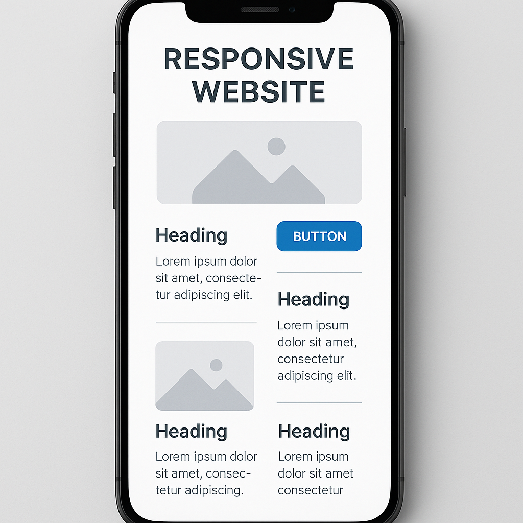
What a Mobile-Optimized Site Actually Looks Like
It is not a matter of merely reducing the size of your desktop site.
A website optimized for mobile use:
- Uses adaptive design that responds to any screen.
- Fast loading—even on 4G or unreliable Wi-Fi.
- Displays the same content for desktop and mobile users.
- Maintains straightforwardness and accommodates the fingers quite well.
- Steers clear of bothersome pop-ups and gigantic graphics.
- Elucidates Core Web Vitals such as LCP, FID, and CLS.
To sum up, it has an appealing look and feel, is visually attractive, and is functionally sound—across all sorts of devices.
Mobile-First SEO Checklist
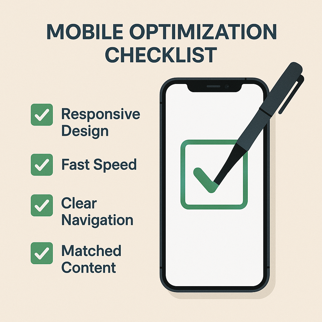
Prepared to become serious? Here is an uncomplicated action list to accelerate your website:
1. Ensure that all content across the platform adheres to the same standards, tone, and style.
2. Regularly review and revise content to maintain consistency.
3. Use style guides to ensure uniformity in language and expression throughout all content.
The content of the desktop version must be identical to that of the mobile version, encompassing all areas such as headers, text, images, internal links, and structured data.
Use design that can adapt to any screen size.
The preferred method for Google is responsive design. Don’t use the outdated m. subdomain. It’s overly complex and hard to manage.
Fix Speed Site
Reduce image sizes. Reduce code. Use cache. Google’s PageSpeed Insights and Lighthouse will tell you exactly what’s making you slow.
Improve Navigation
Menus must be crystal clear, simple to tap, and should not necessitate any zooming or pinching at all. Imagine them as friendly to the thumb.
Test on a regular basis.
Utilize the Mobile-Friendly Test and Search Console from Google to keep an eye on how your site appears to mobile users (and Googlebots).
What Happens When You Ignore This?
Let us not put too fine a point on it. To ignore mobile-first indexing is to ignore the very audience that is the largest for many companies.
A big-name e-commerce company saw its numbers drop after it introduced a fancy desktop redesign. But our friend’s site was barely functional on mobile. Pages were not accessible. Buttons and other critical calls to action were too small. And the mobile version of the site was missing critical product detail lore.
They didn’t consider mobile first. Google did. And they paid the price.

Top Tools to Get You Mobile-Ready
You don’t have to work all this out by hand. Here are some reliable tools:
Google Search Console – Verify that crawl is successful and check mobile usability.
Lighthouse – Execute in-depth mobile performance evaluations right in Chrome.
Speed Insights for Page – Optimize mobile efficiency and speed along with user experience.
Test to see if your pages are mobile-optimized in the eyes of Google. Mobile-Friendly Test.
The Bottom Line
It’s now the new baseline—not an option—but a requirement: mobile-first indexing.
Google has already made the shift. Now it is your turn to ensure your website can keep pace. This necessitates concentrating on the experience of users accessing your site via mobile devices. To do this well, you will need to focus not only on making a mobile version of your site but also on some aspect of user experience that looms large in the majority of mobile sessions—speed.
The golden rule is this: If it is not good enough for mobile, it is not good enough for Google.
Commence the auditing, optimizing, and upgrading now—this change is here to stay.
FAQs
Q1: How can I determine if my site is indexed with mobile-first?
Navigate to Google Search Console → Settings → Crawl Stats. If the crawler listed is “Smartphone,” then your site is using mobile-first indexing.
Q2: Can my mobile site have fewer features than my desktop site and still be okay?
No. Content or functionality that is absent can damage your rankings. Ensure that both versions are in sync.
Question 3: What differentiates responsive design from the mobile URL structure?
In responsive design, the same HTML page will be served regardless of what device is being used. The differences in presentation between an iPad, for example, or an iPhone, or a laptop, are handled via CSS. This is not to say that you can’t have a mobile URL with responsive design; you can. But often, when you see mobile URLs, they are actually serving up a completely different version of the page, both in terms of the HTML and the way it’s styled.
Using responsive design means building one site that serves all devices, using the same URL. Devices are recognized by the server, and the server adjusts the layout by serving different CSS (style sheets) and sometimes different HTML (basic page structure) to different classes of devices. This is a more straightforward and sustainable way of doing site design.
Q4: Can sluggish mobile pages damage my SEO?
Certainly. The speed of a web page is a ranking aspect—most notably on mobile devices—due to something known as Core Web Vitals.
Q5: How often am I to test my mobile site?
At minimum, every three months, or when you have significant new items to report. Tools such as Lighthouse and PageSpeed Insights are helpful to use.

