In the world of SEO these days, on-page structure still quietly does a lot of heavy lifting. People scan pages fast-usually just the headings first-and search engines use that same structure to figure out what your content is really about. Get the headings right and pair them with solid content checks, and you suddenly have pages that hold visitors longer, feel more helpful, and rank with less effort. I’ve optimized hundreds of pages like this, and the difference is usually noticeable within a couple of months.
Let’s talk about why it actually matters.
A clear page layout works like a friendly guide. Crawlers pick up the main idea from your H1 and see how subtopics connect through H2s and H3s. Readers do the same thing-they glance at headings to decide if the page answers their question. When that flow is missing-maybe no proper H1, levels skipped, or walls of text-people bounce quicker, and signals to Google weaken. Clean structure cuts bounce rates and boosts time on page because everything feels easy to follow.
Content diagnostics help spot those issues before they hurt performance. They catch thin spots, overly complicated wording, or places where you could naturally slip in related terms. Pages built this way tend to perform better in clicks and conversions simply because the information lands where people expect it.
I’ve seen it time and again: a cluttered page gets rewritten with proper hierarchy, and traffic starts climbing steadily.
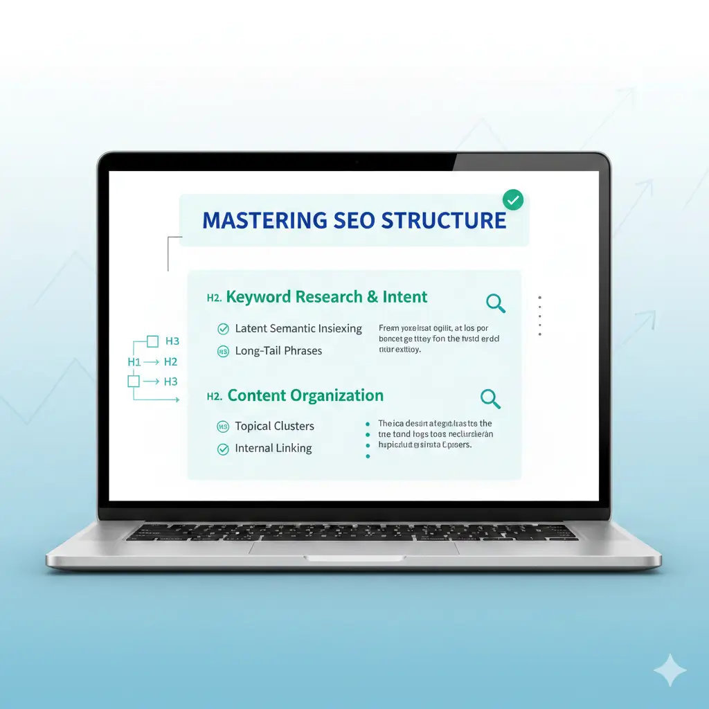
Why Heading Hierarchy Still Makes a Difference
Headings basically build the skeleton of your page. Start with one solid H1-the page title-that includes your main keyword early and tells readers exactly what they’ll get. Stick to just one per page; more than that splits focus and confuses things.
Then come the H2s for the big sections, breaking everything into clear chunks. H3s dive deeper under those, and you only go to H4 or lower when it really adds value. The key rule? Don’t skip levels. Jumping from H2 straight to H4 throws off both people and algorithms.
Keep headings short and meaningful-aim for under 60 characters on the H1, a bit more on others. Write them like natural questions or promises so they preview what’s coming. Sprinkle in keyword variations where they fit without forcing it.
For something around 1,500 words, you might end up with one H1, maybe six to nine H2s, and a handful of H3s. That creates a nice outline that’s easy to scan, works great for screen readers, and sometimes even lands you featured snippets.
Diagnostics catch the usual suspects pretty quickly: extra H1s snuck in by a theme, boring labels like “Introduction,” or headings thrown in just to make text look pretty instead of structured. Fix those, and suddenly the page has a much stronger topic map. Search engines pick up on it, indexing improves, and updates become way easier down the line.
When headings match what people actually want to know, internal links flow naturally too-each section can quietly point to deeper content on the site.
How to Run Effective Heading and Content Diagnostics
Diagnostics aren’t just about finding typos. They look at the whole picture: does the structure make sense, is the flow logical, how readable is it, where are keywords sitting?
You can start simple-open the page, right-click to inspect, or grab a free browser extension that draws a heading tree. Those visuals show breaks or duplicates right away.
For more depth, good SEO platforms run automated checks. They score heading setup, spot repeats, check word count per section, flag high readability scores (anything over grade 10 usually feels too dense), and suggest spots for lists or shorter paragraphs.
Pay attention to these red flags especially:
- No H1 or an empty one
- Headings out of order
- Sections that feel skimpy or unsupported
- Overly complex sentences everywhere
- Chances to break things up with bullets or steps
Run the check before you edit and again after. The numbers show real progress. Many tools also point out smart places to add keywords to headings-main term up top in the H1, related ones spread naturally lower down.
But don’t stop at the technical stuff. Ask yourself: do these headings actually lead someone through the answer step by step? If the sequence feels off from how people think about the topic, add examples, quick stats, or clearer explanations where gaps show up.
A Practical Workflow to Fix and Improve
Here’s the step-by-step I usually follow-it’s straightforward and gets results.
First, map what’s there now. Screenshot the heading outline or export it and mark every problem.
Next, rewrite headings so they’re clear, benefit-focused, and include keywords naturally-no awkward stuffing.
Then fill in weak spots. Diagnostics highlight thin sections; beef them up with real examples, data points, step-by-step breakdowns, or even a quick comparison table.
Make everything easier to scan: keep paragraphs short (three to five lines max), drop in a subheading every 300–400 words, and use bullets or numbered lists liberally.
Weave in a few internal links from headings or strong sentences to related pages-it spreads page authority and keeps people clicking around.
Finally, double-check everything. Re-run diagnostics, look at it on mobile, and test with a screen reader to make sure it’s accessible.
After that, just watch the metrics: organic visits, time on page, rankings for your target term. Repeat every few months or after big updates. Pages handled this way often jump 20–50% in performance pretty reliably.
Things That Trip People Up (and How to Dodge Them)
Overdoing keywords in every heading is common-it kills readability fast. Keep language natural.
Another one: using headings just for bold styling instead of real structure. That leads to skipped levels or weird nesting. Keep styling in CSS and semantics in HTML.
Balance is important too-don’t overload short pages with headings, and don’t leave long ones as giant blocks.
And always check mobile. A hierarchy that looks perfect on desktop can collapse or feel off on smaller screens.
Improving structure like this isn’t flashy, but it compounds. Strong headings plus honest diagnostics create pages that feel trustworthy and helpful. Readers stay, Google notices, and traffic grows without constant chasing.
If you’re ready to audit and tweak your own pages properly, check out SEOSets.com-they have solid tools and guidance built exactly for this kind of work.
Frequently Asked Questions
How many headings should a typical page have?
No hard rule, but for 1,500–3,000 words, one H1 plus 4–10 H2s works well, with H3s filling in as needed. The point is scannability, not hitting a magic number.
Do heading tags directly move the needle on rankings?
Not a massive standalone factor anymore, but good ones improve how Google understands and crawls your content, plus they lift user signals that do matter.
What are the best tools for running these diagnostics?
Free browser extensions outline headings quickly. For full audits-including readability, structure scores, and suggestions-look at platforms like Semrush, Ahrefs, or Surfer. They handle the heavy lifting.
Should every page follow the exact same heading setup?
Not really. Match the hierarchy to the page’s topic and what searchers want. Templates keep things consistent, but tweak for intent every time.
How often do you need to run diagnostics?
Before any major refresh, quarterly on important pages, and right after publishing new content. It keeps everything sharp without much ongoing hassle.

